

























How nicotine pouch formats and packaging have evolved
The slim white pouch and the round catch-lid can feel inevitable — they weren't. How pouch formats and packaging evolved into today's conventions.
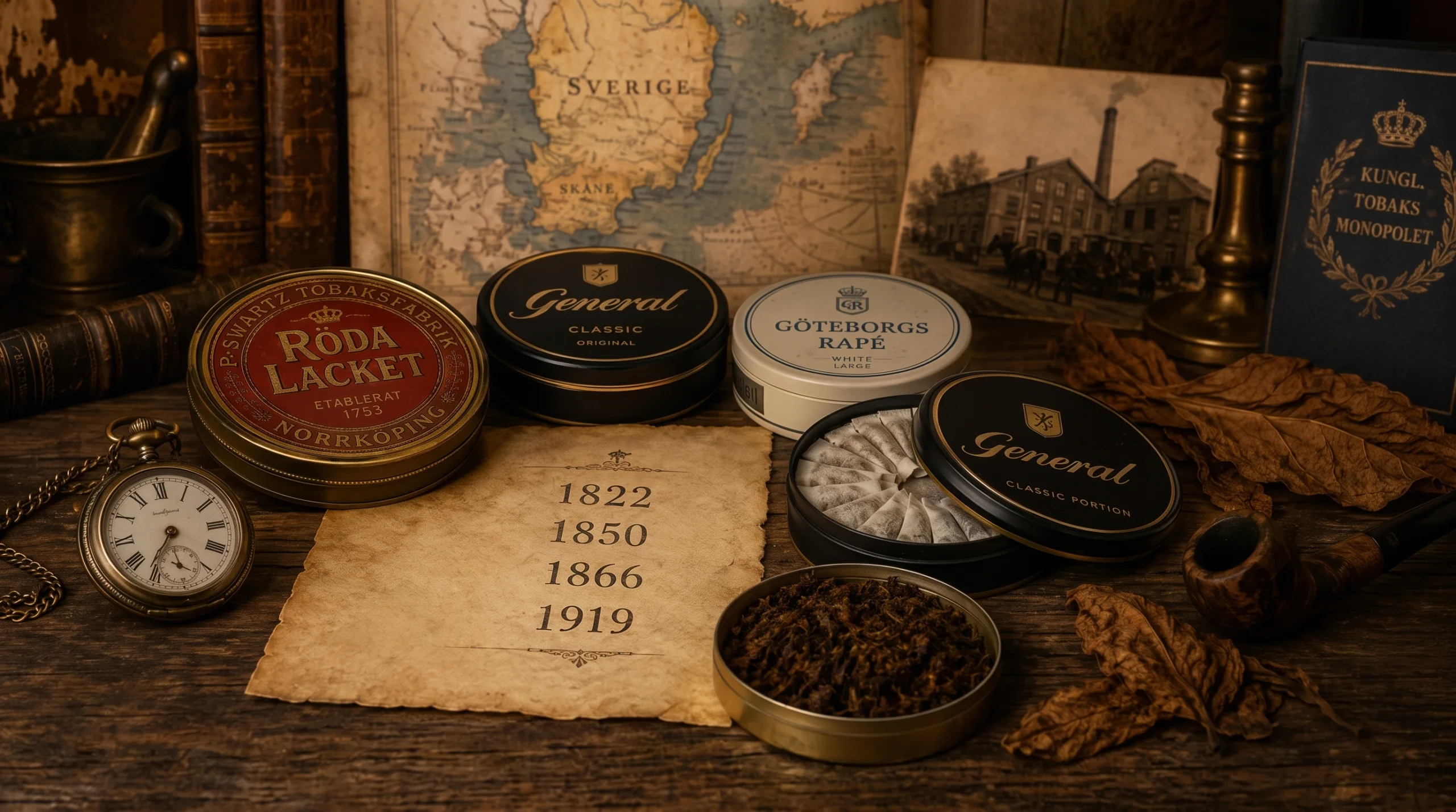
Hold a modern pouch can and every design decision feels obvious: the palm-round shape, the flip catch lid for used pouches, the slim white portions in tidy rows. None of it was obvious. Each convention is the surviving answer to a real problem, refined across generations of oral products. This is the design history of the thing in your pocket — told through the problems, since the dates and brand genealogies belong to a properly sourced account.
From loose to portioned
The category’s ancestral form was loose — a moist blend portioned by hand, with all the mess and variability that implies. The pre-portioned pouch was the pivotal invention: a fixed dose in a clean sachet, consistent from first to last, usable anywhere without technique. Almost everything since — formats, strength labelling, even how strength is expressed per pouch rather than per gram, as covered in mg per pouch vs mg/g — depends on that first step from bulk material to unit dose.
The format family tree
Portioning created a new design question: what shape should a portion be? The answers arrived as trade-offs between presence and discretion. The fuller traditional cut — today’s regular — prioritised substance and a long, even release. The slim cut followed the lip line for a lower profile and became the modern default as discretion rose in value. The mini pushed that logic to its end: near invisibility, often paired with lighter strengths. All three co-exist because the trade-off is genuinely personal — the practical comparison lives in formats explained.
The white turn
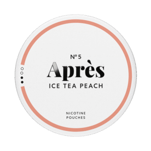
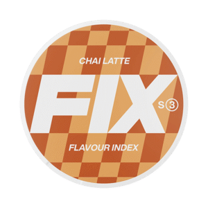
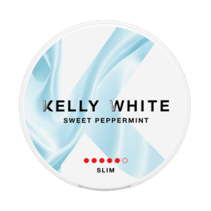
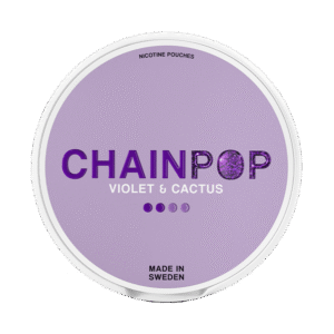
The move from brown, tobacco-based contents to white, tobacco-leaf-free blends was the category’s defining break — a composition change first, but a design change too. White signalled a different product: no staining, flavour-forward, closer in visual language to confectionery or oral care than to tobacco. Packaging followed the signal — lighter palettes, flavour-led naming, strength scales presented like consumer information rather than tobacco branding. The full story of that split is told in from snus to nicotine pouches.
The can as quiet engineering
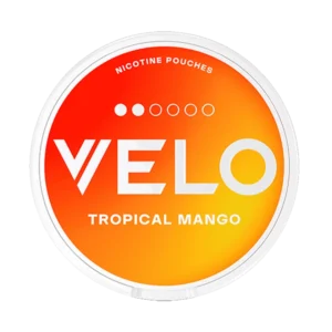
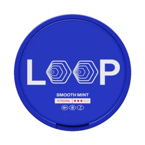
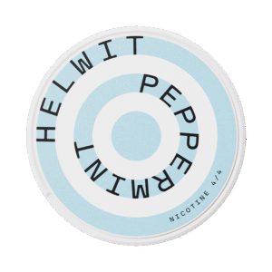
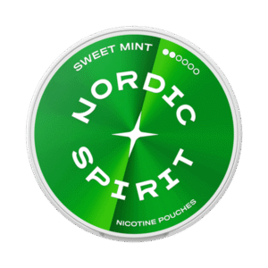
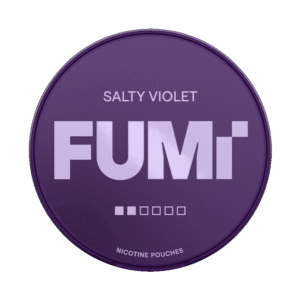
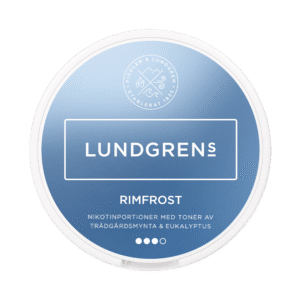
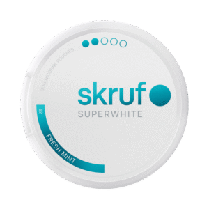
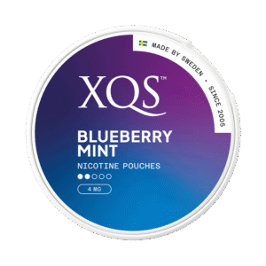
The round can predates the modern category, but the white-pouch era refined it into a small piece of product design: moisture-retaining materials to keep pouches fresh; the catch lid — a second compartment in the top — solving the used-pouch problem that once meant bins or worse; child-resistant closures as nicotine products met consumer-safety expectations; and the label maturing into a structured information panel of strength, count, warnings and dates. That panel is now dense enough to deserve its own literacy course: how to read a nicotine pouch can.
What evolves next
Format and packaging keep moving with the same three pressures that drove every step above: regulation (labelling standards, closure requirements), competition (clearer shelf legibility, as ranges churn in the ways described here), and sustainability — can materials and recyclability are the design conversation visibly gathering pace. The safest prediction in a young category: today’s conventions are a snapshot, not an endpoint.
Key takeaways
- Pre-portioning was the pivotal invention; formats are refinements of the portion.
- Slim, mini and regular survive together because presence vs discretion is a personal trade-off.
- The white, leaf-free turn changed design language as much as composition.
- The modern can — catch lid, closures, information panel — is quiet, accumulated engineering.