





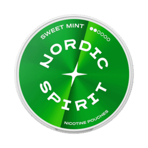

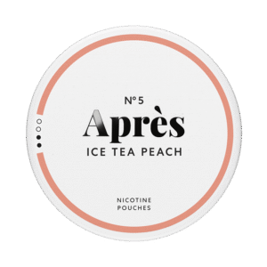

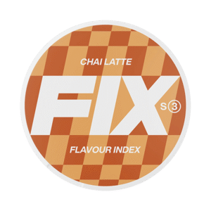

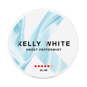







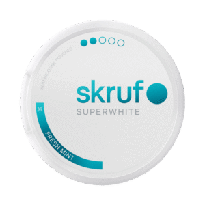

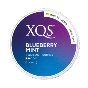


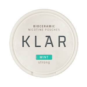




What to look for when a nicotine pouch brand updates its packaging
A redesigned can raises one real question: what, if anything, changed inside? A practical checklist for verifying a familiar product in unfamiliar packaging.
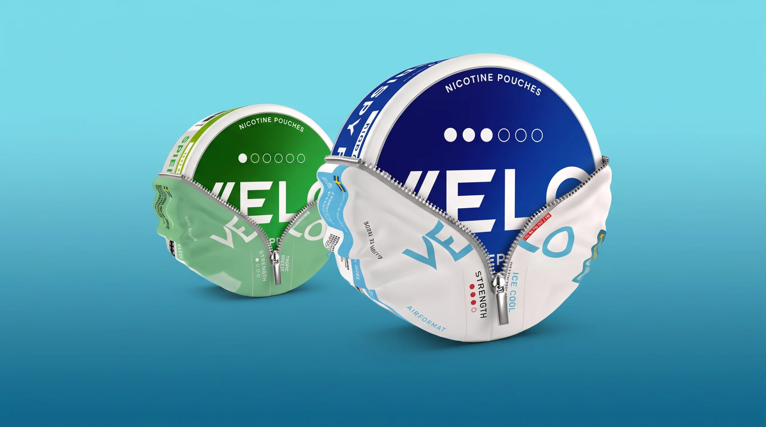
Packaging refreshes are a regular rhythm in this category: brands harmonise designs across markets, comply with new labelling rules, or simply modernise. For the user, a redesign creates one moment of genuine uncertainty at the shelf — is this still the product I know? This evergreen checklist is how to answer that in under a minute, for any brand’s redesign, whenever it happens.
Why cans get redesigned at all
- Regulatory labelling changes — updated warning formats, ingredient declarations or strength presentation required by local rules.
- Cross-market harmonisation — one global design language replacing regional variants, so the same product stops looking different in different countries.
- Range legibility fixes — clearer strength scales and family colour-coding, often the user’s quiet win in a redesign.
- Plain rebranding — new identity, same pouches.
The verification checklist
Put the new can next to what you remember of the old one — or an actual old can if you have it — and compare the printed facts, not the design:
| Check | What a match means | What a mismatch means |
|---|---|---|
| Strength (mg) | Same dose per pouch | A real product change — re-decide, don’t assume |
| Unit (per pouch vs /g) | Same measuring convention | The number may differ while the product doesn’t |
| Format word | Same physical pouch | Feel will change even at identical strength |
| Pouch count | Same value per can | The price comparison just changed silently |
| Flavour name | Continuity of profile (usually) | Renamed — or genuinely reformulated; taste will tell |
Each of those fields, and where to find them on any can, is covered in how to read a nicotine pouch can. If every printed fact matches, you are very likely holding the same product in new clothes. If the milligrams, unit or count moved, treat it as a new product wearing a familiar name — the conversion arithmetic in mg per pouch vs mg/g settles the strength question definitively.
The changes print can’t show
Redesigns sometimes coincide with recipe tuning that no label discloses — moisture, sweetness, cooling intensity. The only instrument for that is a deliberate first can: use it at your normal rhythm and note whether the arc feels familiar. One changed pouch proves nothing; a consistently different can is information. And if the update coincides with products appearing or vanishing around it, you are watching ordinary range evolution, explained in why ranges change over time.
A word on authenticity
Redesign windows are when unfamiliar-looking cans are easiest to mistrust — and when counterfeit or grey-import products are easiest to miss. Buying from reputable retailers is the real protection; on the can itself, mandatory warning text, coherent ingredient labelling and a legible batch/best-before print are the quick plausibility checks. When in doubt about a “new look” nobody announced, the brand’s own channels — like the brand pages on our brands index — are the reference for what current packaging should look like.
Key takeaways
- Compare printed facts, not design: strength, unit, format, count, flavour name.
- All facts matching ≈ same product, new clothes; any fact moving = re-decide from scratch.
- Recipe tuning is invisible on the label — one deliberate can at your normal rhythm is the test.
- Redesign windows deserve extra authenticity attention; buy from retailers you trust.